
Paragraph Layouts
This is a cheat sheet reference to the paragraphs available in Apiboost and their settings
Hero

Hero Paragraph
Fields:
Title: H1 header text to overlay the background image
Body: Paragraph text to display under the header
Link: Two fields required to render the CTA button under the paragraph text
URL: Source URL to send user when clicking the button
Link text: The label text displayed on the button
Anchor Name: If using anchor links or the table of contents, what the “name” attribute should be in the URL (ex.: /home#anchorname)
Background Image: An image to use for the hero background. Will be cropped to 360px height by default.
Text Color: Can choose between black or white text, whichever contrasts better with your background
Featured Products
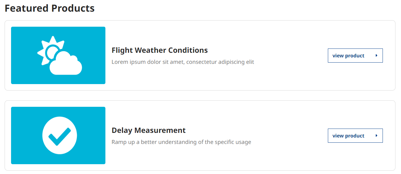
Featured Products layout in V2
Fields:
Title: There are several use cases which this paragraph would be suitable. Choose a name that best describes its intended purpose.
Featured Products: Choose up to six (6) products to feature.
Display Mode for Products: The screenshot above uses thumbnail images. However, if you were to use icons, the cards would render like this instead:
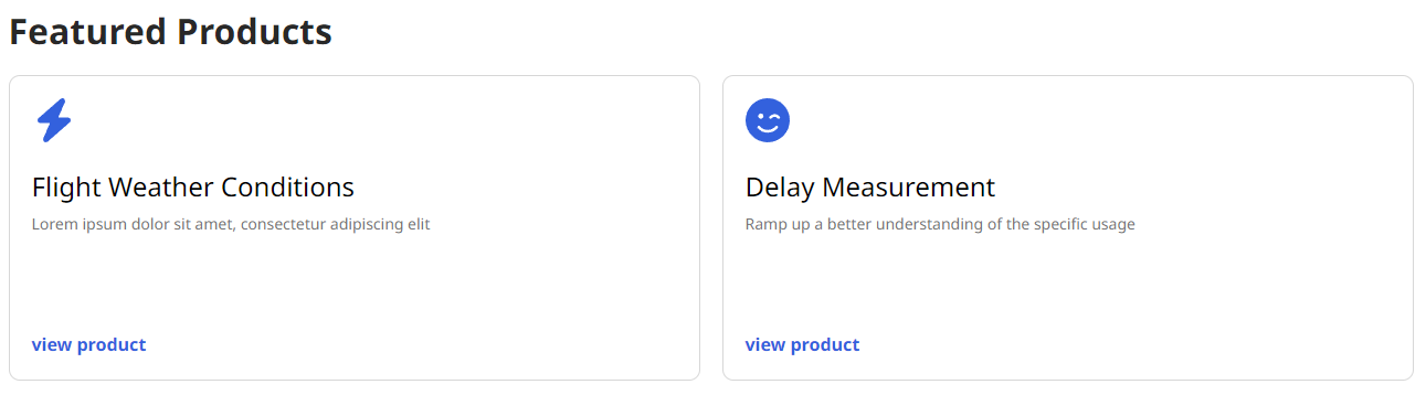
Featured Products with icons
This paragraph is restricted to one instance per page and does not have any impact on the featured products displayed in the catalog. For more information on featuring products in the catalog, please refer to our product documentation.
More Products
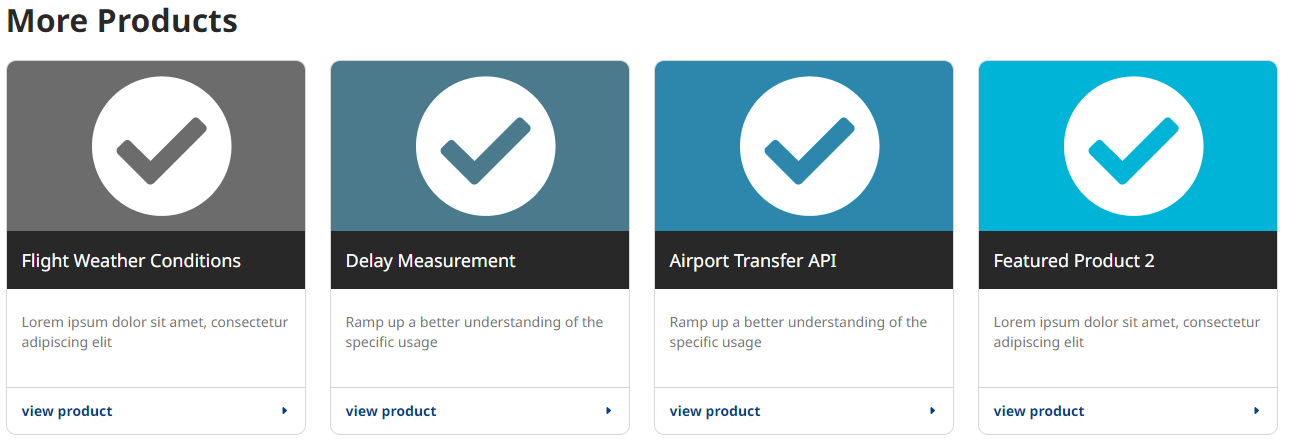
More Paragraphs layout on V2
Fields:
Title: Similar to Featured Products, can be anything. It’s recommended to use language that best represents what the paragraph is being used for.
Product(s): Paragraph can display an unlimited amount of products. User cannot add the same product more than once, and display limits to four columns as seen in the screenshot above.
Display Mode for Products: Works the same as featured. Will show the cards using icons and alternate styling:
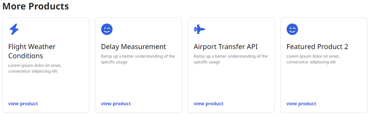
More Products using icons instead of thumbnails
Tip: Multiple instances of this paragraph can be used on a page, allowing flexibility to display other paragraphs between rows of products and the switching of styles for variety.
FAQ Group

A sample FAQ group with a category from taxonomy applied
Fields:
Category: Excellent for distinguishing one FAQ group from another on the same page. The FAQ group category displays above the questions/answers.
FAQ Group categories can be administered from Structure → Taxonomy → FAQ Category or by clicking the “FAQ Categories” link under “Taxonomy” in the left side admin menu.
Subset of FAQ Group are the FAQ fieldsets:
Question: The display question to be expanded on
Answer: The answer to the question used in the previous field
Add Another Item (Button): Adds more FAQ fields. No limit to how many questions can be in a FAQ group.
Latest Blogs
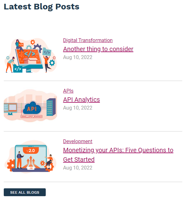
Latest blogs paragraph, half width using 50/50 paragraph
Fields:
Blogs paragraph adds a view that shows the 3 latest blog entries, and a link to the blogs landing page. There is only one configurable field:
Title: In the example above, the title is “Latest Blog Posts.” Title can be anything, or left blank if preferred.
Title & Text
Body text with a themed heading title
Fields:
No surprises, a title and text paragraph is body text with a header title. Simple.
Title: The title of the paragraph
Body: Body paragraph text
Title w/ Text & Link

Similar to Title and Text, but with a CTA
Fields:
Essentially the same as the paragraph above, adding a field set for a CTA link:
URL: Can be a relative link (ex: “/catalog”) or a URL to an external site.
Link Text: The label text for the buttons. In the example above, “View All APIs” would be the link text.
Text w/ Image
Text with Image (Left)
There are two text with image paragraphs. As the names suggest, they only differ in image alignment.
Fields:
Text with image adds a Title and Text paragraph with an image aligned to the side.
Use Existing Media: If you’ve already uploaded the image to the website, you can search the filename in this reference field. Else, you can upload the image first by clicking the “media add page” link.
Text w/ Video (Left)

Text with Video (Left)
Fields:
Extremely similar to the Text with Image paragraph. The only difference is the media field requires a video instead of an image.
Use existing media: Similar to adding an image. Embedded content (ex. YouTube) is supported by adding it to media as “remote video.”
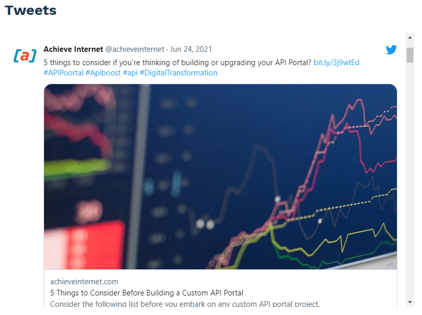
The Twitter paragraph with Tweets embedded
Fields:
Self-explanatory, embeds a twitter feed onto the site
Title: Same as other paragraphs, is optional. In the example above, the title is “Tweets”
Tweet: The username whose Tweets should be loaded. Does not require an @ prefix, only the name (ex. “achieveinternet”)
50/50
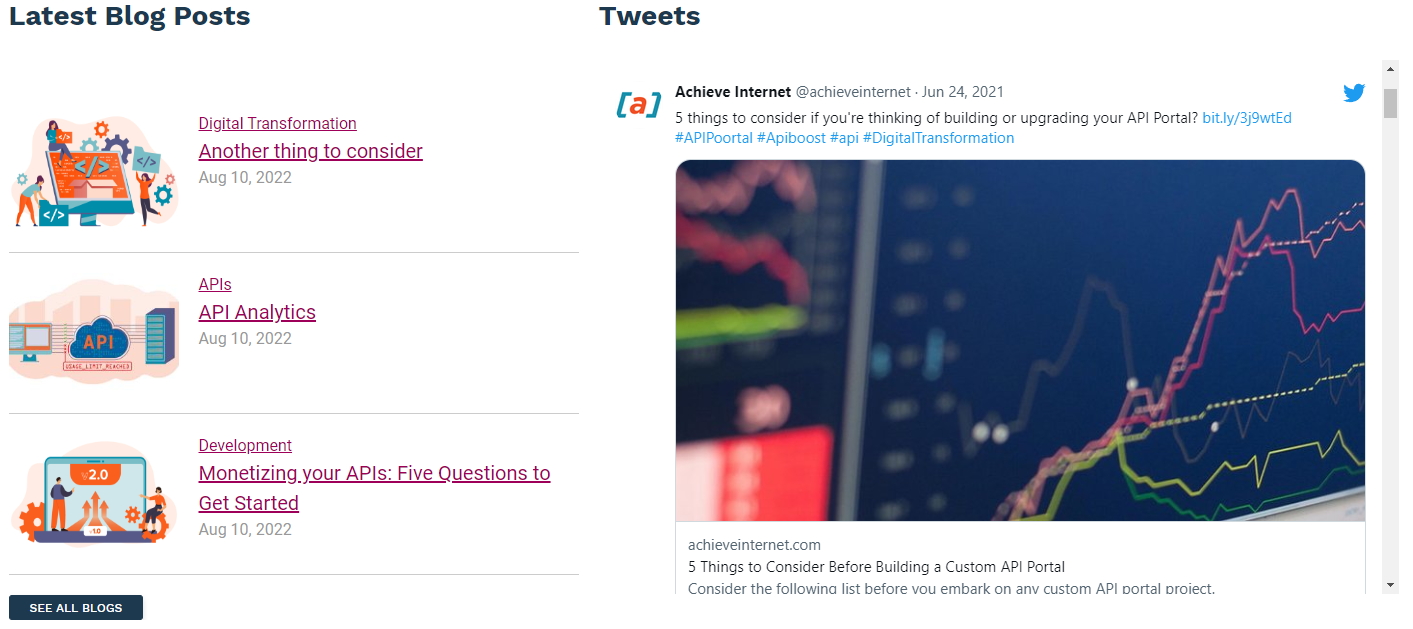
A 50/50 container using Latest Blogs and Twitter paragraphs
Is a layout more than a set of fields to create content
Supports a number of paragraphs that can be displayed as 50/50, including:
FAQ Group
Image
Latest Blogs
Text
Title and Text
Title with Text and Link
Twitter
Our Partners

Displays partners as a logo ribbon
Fields:
Our partners paragraph requires partner nodes to display.
Partner nodes are easily created by adding partner:
Adding a partner using the side admin menu
Our Products
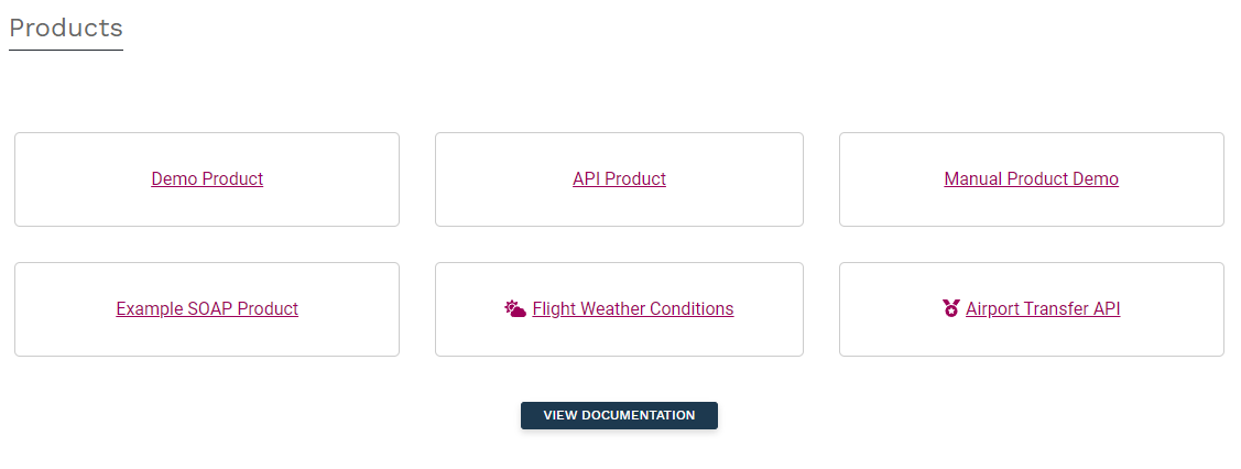
The Our Products paragraph embeds a grid of latest updated API Products
Fields:
Our Products paragraph adds a grid that shows the 6 most recently updated API products.
Title: In the example above, the title is “Products.” Can be left blank, if desired.